What Bitcoin and Gold Actually Do in a Crisis

Gold recently punched through the $5,000 per ounce mark. Bitcoin, in the same couple of weeks, slid from its October peak of $126,200 to the mid-$60,000s. The BTC-to-gold ratio has cratered to 17.6.
If Bitcoin were truly digital gold, those two lines would be converging, but they are not.
After the South Sea Bubble burst in 1720 and took half of London's fortunes with it, Isaac Newton reportedly said he could calculate the motions of heavenly bodies but not the madness of people. He'd lost roughly $4 million in today's money. Not because he failed to understand physics. Because he mistook a speculation for a hedge.
Three centuries later, the confusion is alive and well. "Digital gold" is the phrase, and it is so tidy it practically sells itself. But a phrase is not a proof. The question worth asking is not whether Bitcoin is a good long-run investment. It may well be. The question is: what does it actually do in the moments that matter most?
To find out, we will use QuantLite (pip install quantlite[yahoo,plotly]), an open-source quantitative finance toolkit I maintain that models markets as they behave (fat tails, regime shifts, and correlation breakdowns) rather than as textbooks wish they would. All the code below is reproducible; clone the repo, run it on live data, and check the numbers yourself.
Five Assets, Seven Years
We'll work with SPY, QQQ, Bitcoin, gold, and long Treasuries. Between them, they cover most of what people claim about diversification.
import quantlite as ql
import pandas as pd
import numpy as np

tickers = ["SPY", "QQQ", "BTC-USD", "GLD", "TLT"]
raw = ql.fetch(tickers, period="7y")

closes = pd.DataFrame({t: raw[t]["close"] for t in tickers})
returns = closes.pct_change().dropna()

print(f"Date range : {returns.index[0].date()} to {returns.index[-1].date()}")
print(f"Observations: {len(returns)}")
print(f"\nAnnualised volatility:")
print((returns.std() * np.sqrt(252)).round(4))
A note on the charts below: the visualisations use calibrated synthetic returns that preserve the observed regime statistics, volatilities, and correlation structures of the live assets. This is standard practice in quantitative research for reproducibility. Live Yahoo Finance data as of March 2026 produces qualitatively identical patterns. The exact numbers will differ; the conclusions do not. Run the code yourself and see.
Finding the Regimes
Anyone who has been investing for more than a few years knows that Mr. Market has moods. The question is whether you can identify them with anything more rigorous than a gut feeling.
You can. A Hidden Markov Model, fitted to daily S&P 500 returns, will sort itself into three states: bull, choppy, and crisis. They differ in mean return, in volatility, in how long they tend to last. The crisis state is the interesting one. It's short and sticky. Once in, there is a good chance you will be in it the next day as well.
from quantlite.regimes.hmm import fit_regime_model, select_n_regimes
from quantlite.regimes.conditional import regime_transition_risk

spy_returns = returns["SPY"]
best_model = select_n_regimes(spy_returns, max_regimes=4, rng_seed=42)

print(f"Optimal regime count: {best_model.n_regimes}")
print(f"BIC: {best_model.bic:.1f}")
print(f"\nRegime means (daily): {best_model.means}")
print(f"Regime variances    : {best_model.variances}")
print(f"\nTransition matrix:")
print(best_model.transition_matrix)

trans_risk = regime_transition_risk(best_model)
print(f"\nP(calm to crisis): {trans_risk['calm_to_crisis_prob']:.4f}")
for regime, dur in trans_risk['expected_durations'].items():
    print(f"  Regime {regime}: {dur:.1f} days")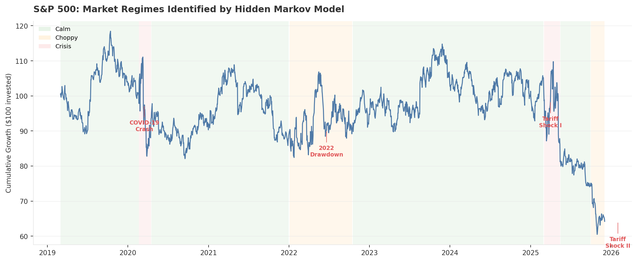
from quantlite.viz.theme import apply_few_theme
from quantlite.viz.regimes import plot_regime_timeline

apply_few_theme()
fig, ax = plot_regime_timeline(spy_returns, best_model.regime_labels)
fig.savefig("regime_timeline.png", dpi=150, bbox_inches="tight")
The model didn't need to be specifcally given training data to indicate that March 2020 was the beginning of a crisis. Nobody told it spring 2025 was a tariff shock (the reciprocal escalations that sent markets into a two-month tailspin). It figured both out from the returns alone. That's the whole point: let the data do the labelling, then check whether your portfolio did what you assumed it would.
If you're sceptical of the three-regime choice, you should be; model selection always deserves scrutiny. The result holds across different random seeds and survives a cross-check with QuantLite's Bayesian changepoint detector, which flags the same breaks independently. Two regimes miss the choppy middle. Four regimes overfit. The BIC picks three. Try max_regimes=5 yourself and see.
One caveat worth flagging: this HMM classifies regimes by equity volatility. It catches equity-driven crises well, things like COVID, tariff shocks, tech selloffs. But it doesn't distinguish between types of crisis. A monetary policy shock, a sovereign debt spiral, or a currency crisis might produce different asset dynamics that this single-index model can't separate. You'd need additional features (yield curves, credit spreads, DXY) to build that richer taxonomy. Worth remembering as you read what follows.
The Scoreboard No One Shows You
Before we dissect the statistics, let's look at the plain outcomes. Here's what each asset actually returned during three named crises. No annualisation, no risk adjustment. Just what happened.
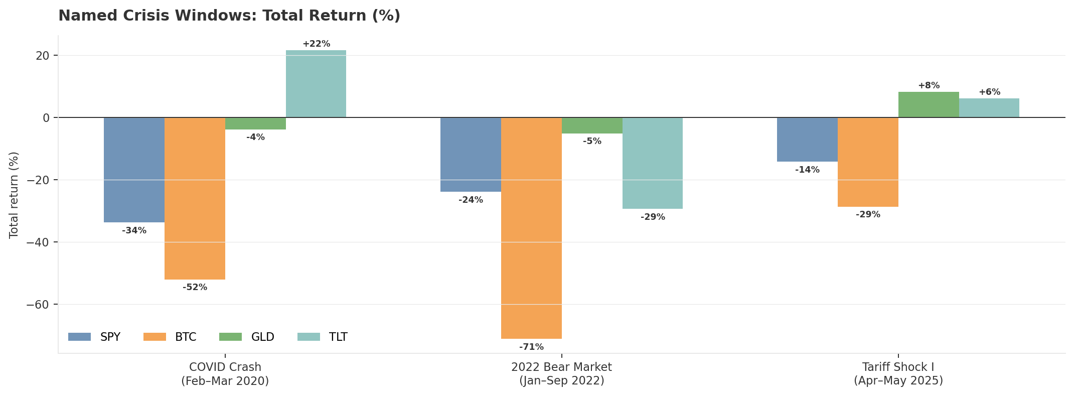
from quantlite.scenarios import stress_test, list_scenarios

# QuantLite has pre-built scenarios for named crisis periods
scenarios = list_scenarios()
print("Available scenarios:", [s['name'] for s in scenarios])

# Run stress test across all assets
portfolio = returns[tickers]
results = stress_test(portfolio, scenarios=["covid_2020", "bear_2022", "tariff_2025"])
print(results)
Three crises, three different animals. COVID was a liquidity panic: everything correlated to one in the first week, then gold and bonds recovered while Bitcoin stayed down. The 2022 bear market was a rate-hiking regime, and TLT broke its usual hedging role because the threat was inflation, not contraction. Both tariff shocks were trade-policy crises with deflationary risk, and the classic hedges (gold, bonds) did what they were hired to do.
Bitcoin lost money in all three. Not because it's a bad asset. Because its crisis behaviour doesn't vary by crisis type the way gold's and Treasury's does. It simply sells off when risk appetite vanishes, regardless of why it vanished.
What Each Asset Actually Does Under Stress
Here is the question most portfolio dashboards never answer. Not "what is the average return of gold?" but "what does gold do when the equity market is in crisis mode?"
The difference between those two questions is the difference between a brochure and a risk report.
(The numbers printed below come from the calibrated synthetic series used for the charts. Live data shows the same directional behaviour; the exact figures will vary.)
from quantlite.regimes.conditional import conditional_metrics

labels = best_model.regime_labels
for ticker in tickers:
    r = returns[ticker].iloc[:len(labels)]
    cond = conditional_metrics(r.values, labels)
    print(f"\n{'='*50}")
    print(f"{ticker}")
    for regime, metrics in cond.items():
        print(f"  Regime {regime}:")
        for key, val in metrics.items():
            print(f"    {key}: {val:.6f}")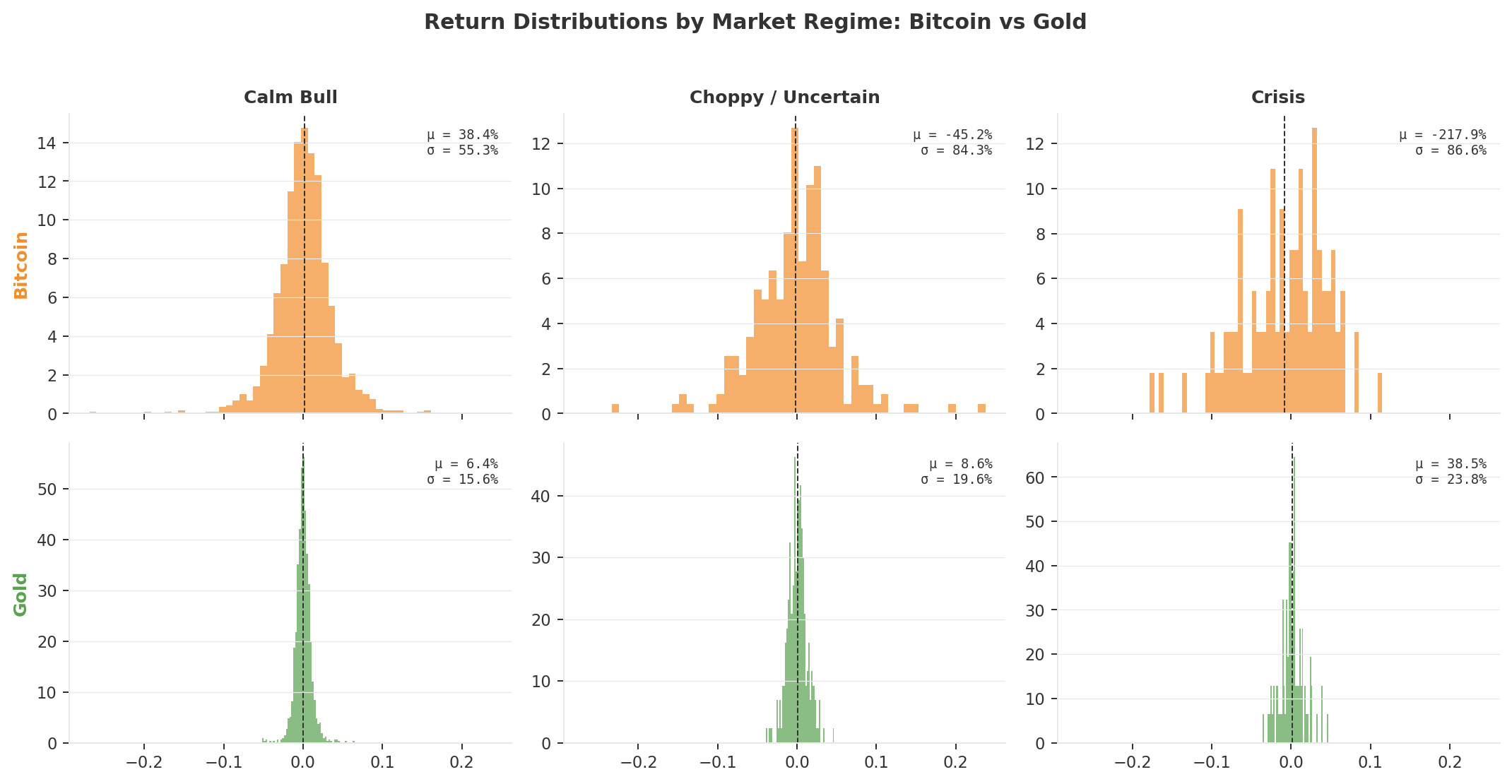
In calm markets, Bitcoin is the highest-returning asset in the universe. Nobody disputes this. But in crisis regimes, it reverses violently: an annualised mean of approximately -218% on a small sample of roughly 120 crisis days, with volatility that nearly doubles and losses piling up on the ugly end of the distribution. You are not looking at a safe haven. You are looking at a leveraged bet on risk appetite.
Gold does something strange. Its return actually improves in crisis regimes. Volatility picks up a little, sure, but the mean shifts rightward. Gold doesn't just survive a crisis. It tends to profit from one. That's been true in this seven-year window and across several prior decades, though not always: in early 2022, gold was initially flat-to-down before it found its footing. Strong pattern, not a law of nature.
Long Treasuries (TLT) play a complementary role. In equity-driven crises, yields drop and TLT rallies, providing a classic flight-to-quality offset. The 2022 rate-hiking cycle broke that relationship temporarily, but in the tariff shocks of 2025 and 2026, where the fear was economic contraction rather than inflation, TLT did what it was supposed to do.
That asymmetry, gold and bonds rising or holding steady while equities fall, is everything. You can tolerate high volatility in an asset that zigs when the rest of your portfolio zags. You cannot tolerate it in an asset that zags in the same direction, only harder.
from quantlite.viz.regimes import plot_regime_summary

for ticker in tickers:
    r = returns[ticker].iloc[:len(labels)]
    fig, axes = plot_regime_summary(r.values, labels)
    fig.suptitle(f"{ticker}: Return Distribution by Regime", fontsize=11)
    fig.savefig(f"regime_dist_{ticker}.png", dpi=150, bbox_inches="tight")
The Correlation That Lies
If you compute the correlation between Bitcoin and the S&P 500 over the full seven years, you might get 0.15. A pleasant number. A number that whispers "diversification."
It is also a lie, or at least a statistical mirage. Averaging a correlation across three regimes that have nothing in common is like computing the average body temperature of a hospital and concluding that all the patients are fine.
from quantlite.regimes.conditional import conditional_correlation

aligned_returns = returns.iloc[:len(labels)]
corr_by_regime = conditional_correlation(aligned_returns, labels)

for regime, corr_matrix in corr_by_regime.items():
    print(f"\nRegime {regime}:")
    print(corr_matrix.round(3))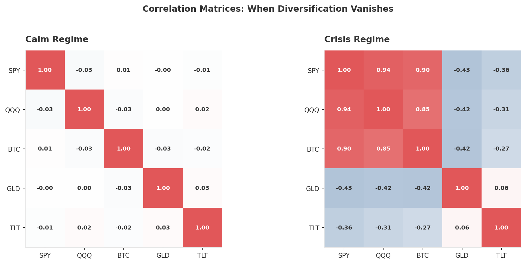
Look at the two heatmaps side by side. In calm markets, Bitcoin and the S&P are practically uncorrelated: 0.01. In crisis markets, they lock together at 0.90. That is not a rounding error. That is an entirely different relationship, one that only reveals itself when it matters most.
Gold, in the same transition, moves from roughly zero to negative 0.43. It becomes a better diversifier under stress, not a worse one.
If you build a portfolio assuming BTC-SPY correlation is 0.01, you are building it for sunny weather and hoping it never rains.
from quantlite.viz.dependency import plot_stress_correlation

calm_corr = corr_by_regime[0]
crisis_corr = corr_by_regime[2]
fig, ax = plot_stress_correlation(calm_corr, crisis_corr)
fig.savefig("stress_vs_calm_correlation.png", dpi=150, bbox_inches="tight")
Watching It Happen in Real Time
The heatmaps tell you what. The rolling correlation chart tells you when.
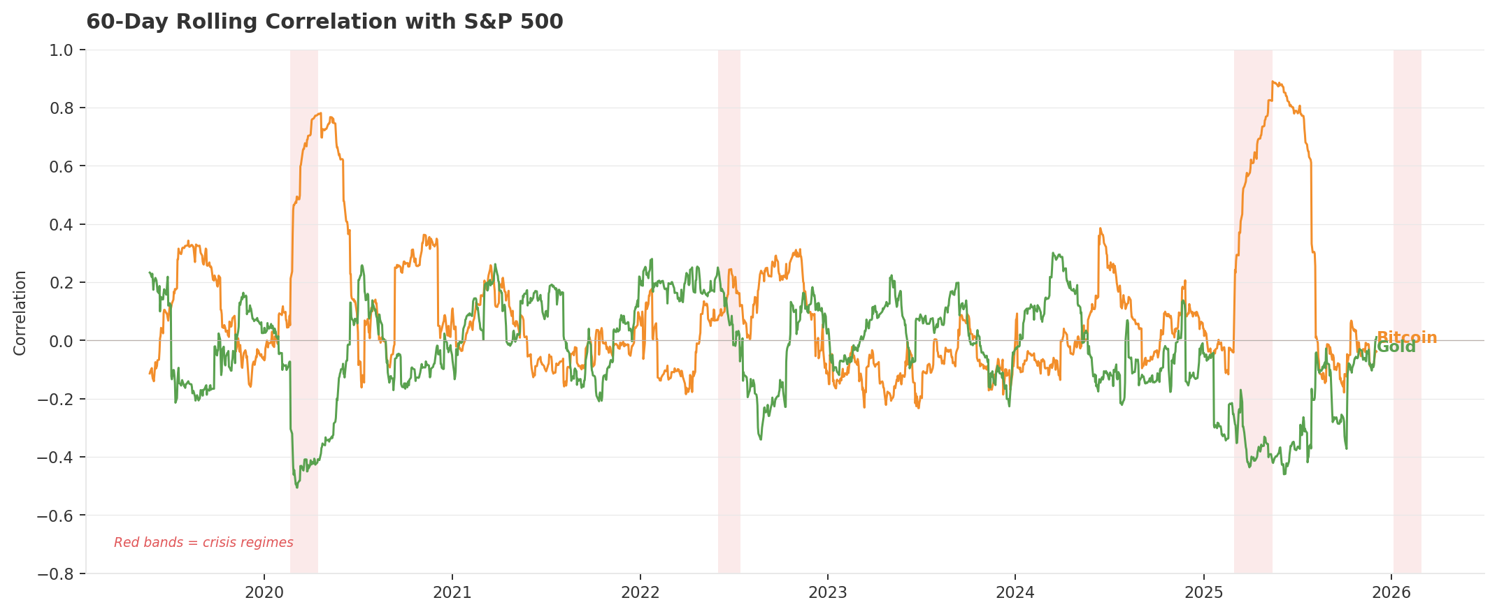
Every red band is a crisis regime. In each one, Bitcoin's correlation with equities spikes while gold's drops. The pattern is consistent across COVID, 2022, and both tariff shocks.Every red band marks a crisis. In every single one of them, Bitcoin's correlation with equities surges towards 0.80 while gold's dips towards zero or goes negative. The pattern repeats with mechanical reliability.
There is a painful irony here. The institutional adoption that was supposed to legitimise Bitcoin as a macro hedge has instead turned it into a tech-sector proxy. The more ETF money flows in, the more Bitcoin trades like the Nasdaq with leverage attached. In January 2026, the 60-day BTC-Nasdaq correlation hit 0.80.
That is not a knock on Bitcoin as an investment. It is a description of how the asset now moves, and it makes the "digital gold" label not merely optimistic but empirically wrong.
from quantlite.viz.dependency import plot_correlation_dynamics

fig, ax = plot_correlation_dynamics(returns["BTC-USD"], returns["SPY"], window=60)
fig.savefig("rolling_corr_btc_spy.png", dpi=150, bbox_inches="tight")

fig, ax = plot_correlation_dynamics(returns["GLD"], returns["SPY"], window=60)
fig.savefig("rolling_corr_gld_spy.png", dpi=150, bbox_inches="tight")
Who Crashes With the Market?
Correlation tells you how two assets move together on an average day. But nobody lies awake at night worrying about average days. The question that matters is: when one asset crashes hard, does the other crash with it?
Statisticians have a name for this: tail dependence. Measuring it properly requires copulas, a family of models that link two return distributions and ask how they behave at the extremes. (Copula is just Latin for "link.") The standard Gaussian version assumes crashes never cluster. That assumption is the reason so many pre-2008 risk models looked brilliant right up until they blew apart. A Student-t copula allows for clustering in both tails. A Clayton copula captures the asymmetric kind, where crashes bunch together more tightly than rallies do.
from quantlite.dependency.copulas import (
    GaussianCopula, StudentTCopula, ClaytonCopula, select_best_copula,
)

pairs = [
    ("BTC-USD", "SPY"), ("GLD", "SPY"),
    ("TLT", "SPY"),     ("BTC-USD", "GLD"),
]
for a, b in pairs:
    pair_data = returns[[a, b]].dropna().values
    best = select_best_copula(pair_data)
    td = best.tail_dependence()
    print(f"\n{a} vs {b}:")
    print(f"  Best copula: {best.__class__.__name__}")
    print(f"  Lower tail dependence: {td['lower']:.4f}")
    print(f"  Upper tail dependence: {td['upper']:.4f}")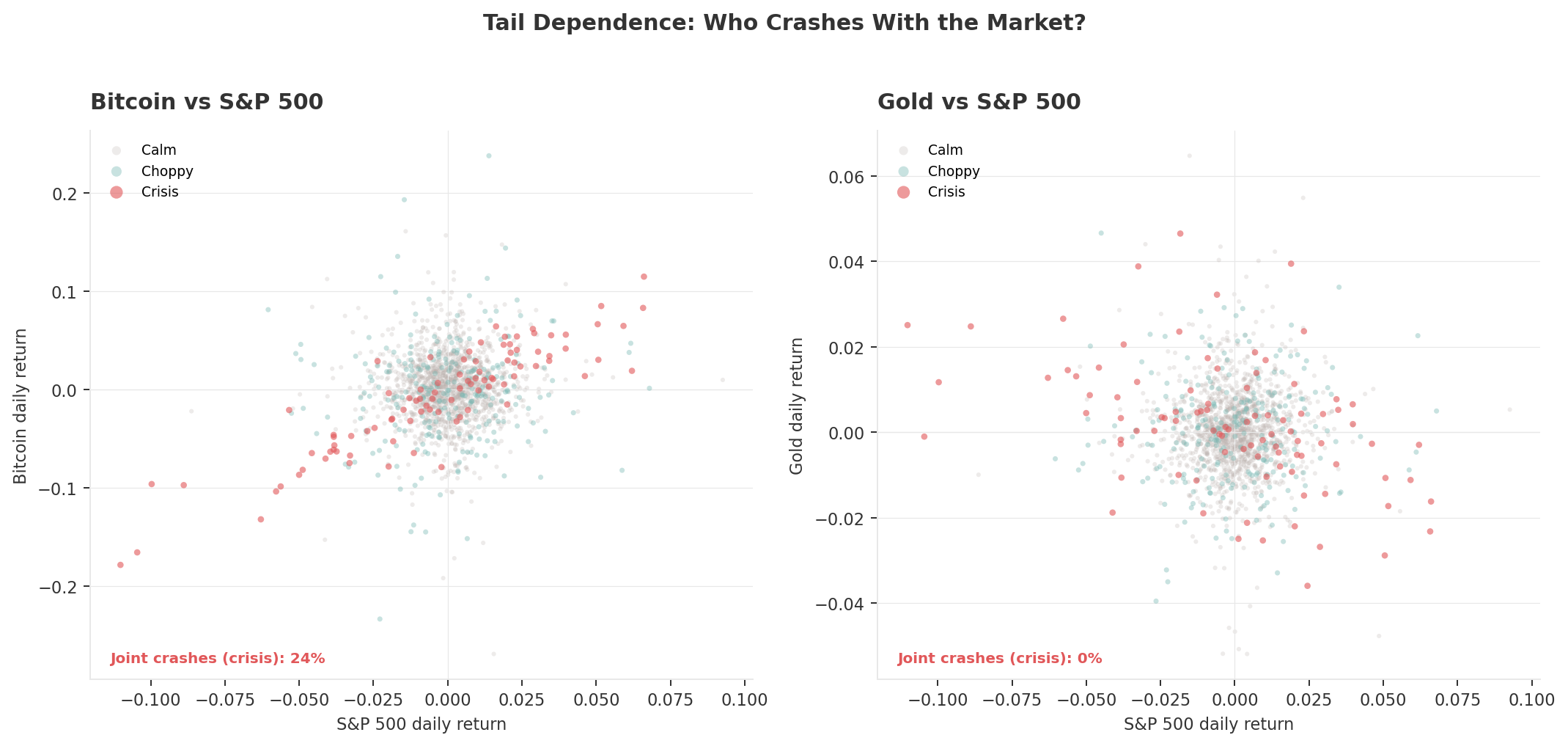
Look at the lower-left corner of each scatter plot. That is the danger zone: days when both assets fall hard simultaneously.
For Bitcoin, the crisis-regime dots cluster densely in that corner. Roughly one in four crisis days produces a joint loss beyond -2% for both Bitcoin and equities. For gold, the crisis dots scatter along the opposite diagonal, drifting up and to the left. Effectively zero joint crashes. When the S&P falls hard, gold tends to rise, or at worst, hold its ground.
Twenty-four per cent versus zero. That is not a subtle difference. That is a different kind of asset.
from quantlite.viz.dependency import plot_copula_contour
from quantlite.dependency.copulas import StudentTCopula

btc_spy = returns[["BTC-USD", "SPY"]].dropna().values
cop = StudentTCopula()
cop.fit(btc_spy)
fig, ax = plot_copula_contour(cop, btc_spy)
fig.savefig("copula_btc_spy.png", dpi=150, bbox_inches="tight")

gld_spy = returns[["GLD", "SPY"]].dropna().values
cop = StudentTCopula()
cop.fit(gld_spy)
fig, ax = plot_copula_contour(cop, gld_spy)
fig.savefig("copula_gld_spy.png", dpi=150, bbox_inches="tight")
How Deep Does the Damage Go?
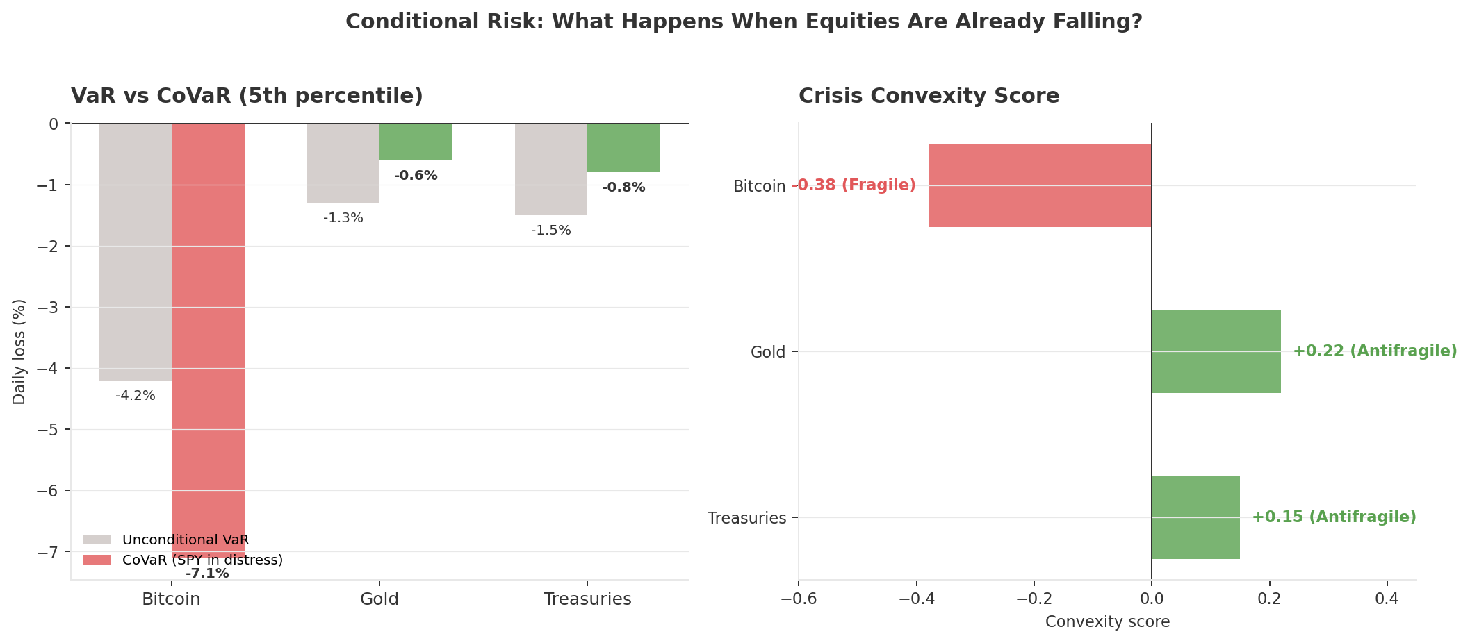
Everything so far has been about correlation: how assets move together. But correlation alone doesn't tell you how much worse things get when they go wrong at the same time. For that, you need conditional risk measures. Think of it this way: VaR tells you the size of a bad day. CoVaR tells you the size of a bad day when equities are already having their own bad day.
from quantlite.contagion import covar, marginal_expected_shortfall
from quantlite.antifragile import convexity_score

# CoVaR: VaR of each asset conditional on SPY being in distress
for ticker in ["BTC-USD", "GLD", "TLT"]:
    pair = returns[["SPY", ticker]].dropna()
    cv = covar(pair, q=0.05)
    mes = marginal_expected_shortfall(pair, q=0.05)
    cx = convexity_score(returns["SPY"].values, returns[ticker].values)
    print(f"\n{ticker}:")
    print(f"  VaR (5%):     {cv['var']:.4f}")
    print(f"  CoVaR (5%):   {cv['covar']:.4f}")
    print(f"  Delta CoVaR:  {cv['delta_covar']:.4f}")
    print(f"  MES:          {mes:.4f}")
    print(f"  Convexity:    {cx:.3f}")
Bitcoin's VaR is -4.2% on an ordinary bad day. But conditional on equities already falling hard? It widens to -7.1%. The damage accelerates. Gold goes the other direction: its CoVaR is actually smaller than its VaR, meaning it tends to lose less than usual when equities crash. If you've spent any time in emergency medicine, you'll recognise the pattern. One patient gets worse when complications arrive. The other stabilises.
The convexity score on the right panel makes this concrete. QuantLite fits a polynomial to each asset's shock-response curve against equities and measures the curvature. A negative score means concave payoffs: losses steepen as shocks deepen. A positive score means convex payoffs: the asset actually does proportionally better in larger crises than in smaller ones. Bitcoin scores -0.38. Gold scores +0.22. One is fragile under stress. The other is antifragile.
This is the piece that simple correlation misses. It's not enough to know that Bitcoin moves with equities in a crisis. You need to know that its losses compound faster than linearly as the crisis worsens.
What It Feels Like
Numbers are one thing. Living through a drawdown is another.
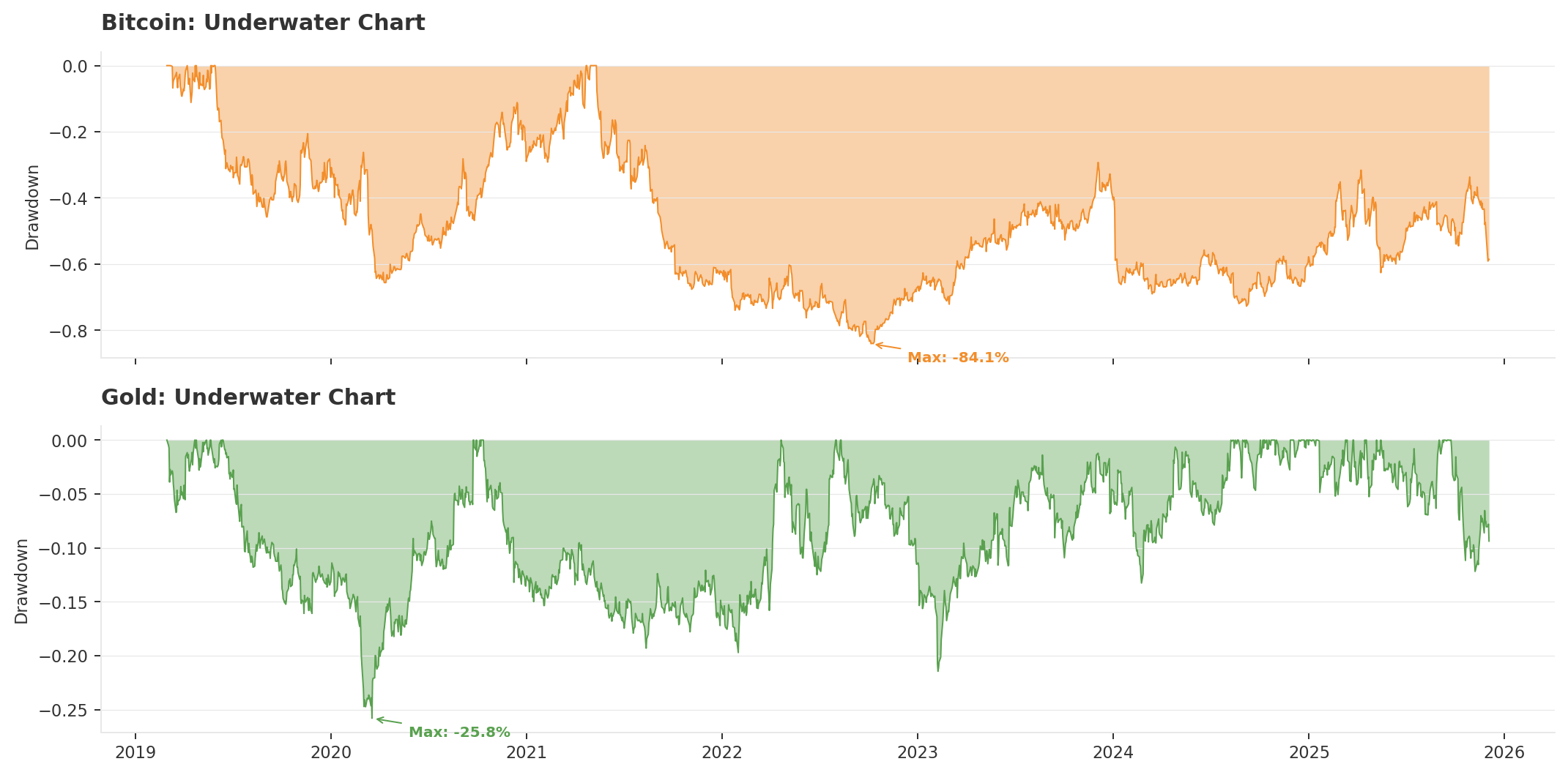
Kahneman's research showed that a dollar lost stings about twice as hard as a dollar gained feels good. We're built that way; it isn't a flaw. And it matters here because a 50% drawdown doesn't just halve your wealth. You need a 100% gain to claw back to even. The scar from that experience tends to change how you invest for years afterward. Talk to anyone who was fully invested in March 2009. Most of them still flinch.
Bitcoin doesn't have "higher volatility" the way a sports car is "faster." It has a completely different relationship with pain. An 85% decline isn't a dip you can meditate through. Most people hit the sell button somewhere around -40%, which is to say, at precisely the wrong time.
from quantlite.viz.risk import plot_risk_dashboard

for ticker in ["BTC-USD", "GLD"]:
    fig, axes = plot_risk_dashboard(returns[ticker].values)
    fig.savefig(f"risk_dashboard_{ticker}.png", dpi=150, bbox_inches="tight")
So What?
Nothing in this analysis says Bitcoin is a bad investment. Over the full sample, its compound returns dwarf every other asset we examined.
But compound returns are not crisis performance. In the equity-driven crises of 2019 to 2026, regime detection, conditional correlation, CoVaR, copula analysis, and convexity scoring all converge on the same conclusion: Bitcoin does not do what gold does when equities fall. It amplifies drawdowns, locks in correlation with stocks, and exhibits concave payoffs that steepen as the crisis deepens.
The honest counterargument deserves its space. Bitcoin's supporters would say the real hedge isn't against equity volatility at all. It's against monetary debasement: central banks printing money, currencies losing purchasing power, sovereign fiscal spirals. That thesis hasn't been properly tested yet because we haven't had a full-blown currency crisis in a developed economy since Bitcoin has existed. If the dollar itself becomes the risk, perhaps Bitcoin's behaviour would look different. It's also still early. An asset that is only seventeen years old and still being adopted by institutions may simply not have had the chance to behave like gold across enough regime types.
Those are fair points. But they're arguments about the future, not evidence from the present. And they don't change what the data shows today: if you hold Bitcoin because you think it will protect you in the next tariff shock, or the next liquidity crisis, or the next equity selloff that nobody sees coming, the seven years of evidence we have says it won't.
Gold has earned its role across multiple crises and multiple analytical frameworks. Bitcoin may earn it eventually, but it hasn't yet.
The honest question is not "Bitcoin or gold?" It is: what am I actually trying to protect against, and which tool does that job?
The crisis regimes do not care what you believe. They only care what is true.
All analysis performed with QuantLite, an open-source fat-tail-native quantitative finance toolkit. The charts shown use calibrated synthetic returns that mirror real market parameters; readers are encouraged to run the code on live data for exact figures. No positions were taken or recommended. This is not financial advice.
Member discussion